 PODspy

A spiral notebook cover design needs more than an attractive front. The title has to stay clear of the coil, the back needs to feel like part of the same product, and both files must arrive at the printer the right way up. This guide builds a fern-and-crescent cover pair and uses one supplier’s A5 specification to show why copying the front layout straight onto the back can go wrong.
The creative shortcut
- Start with the exact notebook template. Front and back covers can put the binding clearance on opposite sides.
- Keep titles and focal details inside each cover’s safe area; build the background separately from essential content.
- Use a matching palette and motif for the pair, then check orientation on paper and reopen the exported files.
Choose the notebook and download both cover guides
Choose the supplier and exact notebook before setting your canvas. Record its orientation, cover print options, finished dimensions, upload dimensions, binding edge and required file format. Download the current front and back templates for that specific product.
Do not borrow dimensions from a different notebook that happens to be called A5 or 6 × 9. The uploaded artwork might include extra space for trimming, and suppliers handle that space differently. Follow the file instructions instead of adding a standard bleed amount from memory.
Keep the front and back as separately named layouts in your editor. Lock each supplier guide on its own layer and label the binding side while working. Remove those working labels from the delivery artwork. If a template does not make the back’s orientation clear, ask the supplier before composing around it.
Move the binding clearance when you build the back
Prodigi’s fully customisable A5 portrait example uses 148 × 210 mm covers. The front has a 12 mm left binding margin; the back has 12 mm at the right. Other margins are 10 mm. This product uses notebook-sized artwork without added bleed or cut marks; Prodigi adds bleed.
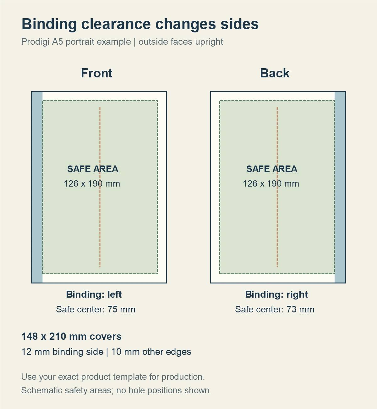
That leaves a 126 × 190 mm safe area. From the left edge, it spans 12–138 mm on the front and 10–136 mm on the back. Those centers are 75 and 73 mm; the canvas center is 74 mm.
Use that safe rectangle as a starting frame for the title and important art. You can then adjust optical balance within it. A perfectly centered text box can still look uneven beside a tall fern or a dark patch. The numbers keep essential content away from the binding; your eye finishes the composition.
Give the front and back different jobs
For the front, use a large sage fern against ink navy, with a small copper crescent near the top and a quiet area for an editable title. Keep the crescent, title and any personalized name inside the safe rectangle. Background color can extend to the artwork boundary as the template requires.
For the back, reuse the palette and a smaller fern motif rather than repeating every front element. Leave the right binding side quiet. This makes the two covers feel related while giving the back its own balance.
Keep the title on a separate text layer in your layout editor. Test the longest name or subtitle you intend to offer, including its descenders and any decorative swashes. Shrinking a long name until it fits can make it unreadable; a deliberate second line or a simpler type treatment may work better.
Avoid a fine frame close to the cover edge. A small shift in trimming or binding can make it look uneven. A continuous background and a motif that has breathing room are easier to judge without relying on perfect edge alignment.
Start the cover illustration in PODspy
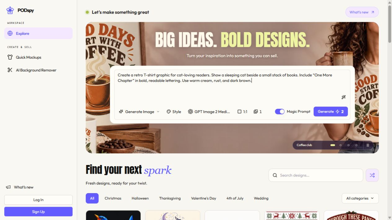
Open this brief in Generate Image, then choose a portrait aspect ratio before generating. The link fills the prompt; you can edit it, and generation starts when you choose Generate. Treat the result as source artwork to inspect and compose in your notebook template.
Check the fern’s leaf shapes, the crescent and the quiet title area. Remove stray marks and unwanted lettering. The generated illustration does not establish a printer-ready file size or a precise safety margin. Apply those in your layout editor.
For a companion back, work from your saved artwork and palette: use a smaller version of the motif or compose a related variation. If you reuse part of an illustration, keep its proportions and inspect the cropped edges. The editorial image above is a concept study, not evidence that this brief has produced an approved physical notebook.
Create flat portrait artwork for the front cover of a spiral notebook, in a restrained gouache and printmaking style. Use an ink-navy background, sage-green fern leaves and one small burnt-copper crescent. Let a single graceful fern rise diagonally from the lower-right area, with clean recognizable leaf shapes and restrained paper texture. Keep the left edge quiet for later binding clearance. Leave a broad calm area in the upper middle for a title that will be added separately, and keep the crescent well inside the upper-right portion. Let the navy background reach every image edge. Artwork only. No words, lettering, names, logos, border, notebook mockup, spiral coil, holes, perspective, shadows, template guides or crop marks.
Fit the art and export the two covers separately
Place the illustration in the front layout and scale it proportionally. A portrait image can still have a different width-to-height ratio from your cover canvas. Use cropping or extend a simple background; do not squeeze the artwork until a crescent or leaf changes shape.
For this example, keep the fern and crescent inside the front safe area, then place the title as live text. Build the back in its own guide, using the opposite binding side. Do not mirror lettering to make a matching pair. Inspect both outer faces upright in the supplier’s stated file orientation.
Use the supplier’s requested resolution, color settings and file format. For this Prodigi product, the guide calls for 300 dpi and separate front and back PDFs. Keep your editable master, but send only the files that the chosen product requires.
Name the outputs clearly, such as fern-a5-front.pdf and fern-a5-back.pdf. Reopen those exact exports and verify page size, spelling, orientation and background coverage. Check that guide lines, safe-area boxes and working labels are absent. An editor preview is not a check of the file you actually exported.
Check the pair as a notebook before listing it
Make a plain-paper layout check at actual size. Measure the printed outline with a ruler rather than trusting the print dialog. Mark the binding side on a temporary working copy, lay the front and back around a stack of paper, and turn the stack over as you would a closed notebook.
Confirm that both cover faces are upright, that the binding is on the intended side of each, and that the name remains readable near the coil. This exercise checks orientation and placement. It does not verify color, material, hole punching or production tolerances.
In the supplier’s product preview, inspect the exported front and back separately and then as a pair. If one motif feels too close to the binding, move it within the safe area and export a new clearly named version.
Order and inspect a physical sample before making claims about printed color, cover texture or binding quality. Keep the approved production files together with the product identifier and template version so a later size or supplier change starts from the right specification.


