PODspy

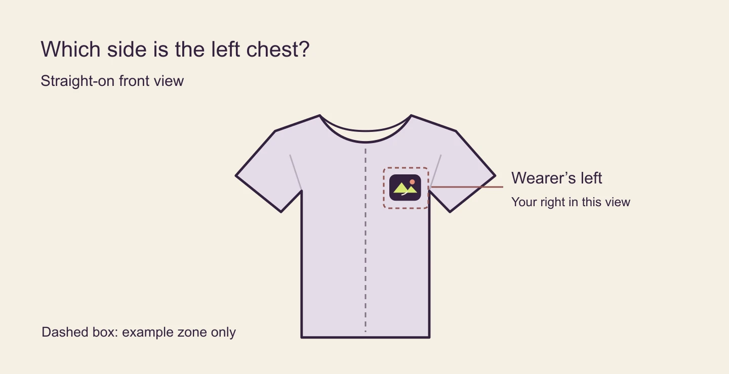
On a shirt facing you, the left chest is on your right. For a compact adult tee logo, about 3 to 4 inches of visible width is a useful starting point if the garment and print area allow it. The important part is what happens after you pick a size: confirm the supported print zone, place the visible mark within it, and check what the provider will do across sizes. This guide walks through those steps with the same small badge in two downloadable files.
The creative shortcut
- Use the wearer’s left and confirm that the supplier supports a true left-chest print area.
- Measure the visible artwork, including its center, inside the upload file.
- Check the selected garment and method, then approve a sample if placement is critical.
Find the wearer’s left before sizing anything
Look at the garment from the front. The wearer’s left is the viewer’s right. A side-facing or mirrored image can make that confusing, so make the decision on a straight-on view first. Use the collar and armhole as visual references. You want the badge to sit on the chest when worn, rather than disappear toward the side seam.
Choose the exact blank, print provider and decoration method. Look for a dedicated left-chest print area in that product’s editor. Some products only offer a centered front area, and moving a logo to that area’s edge may still leave it too central. If the placement you want falls outside the available area, choose a different product or ask the provider what it supports.
Physical transfer guides use landmarks such as the collar edge and underarm seam. Those references are useful when judging the preview, but they don’t replace the supplier’s placement controls. Charts can measure to different points on the artwork or from different seams. Don’t combine two distances without checking exactly what they measure.
Choose a width for the visible mark
Start around 3 to 4 inches wide for a compact adult left-chest graphic. A short wordmark and a tall shield with the same width do not occupy the same amount of chest space. Check height too, and use the smaller of the scale limits imposed by width, height and the provider’s method. Youth tees, fitted cuts and deep necklines may need a different decision.
The print area is the space your provider permits. The upload canvas is the whole file. The visible artwork is the part that actually has ink or decoration. Keep these separate when you compare dimensions. A 4-inch-wide upload can contain a 2.4-inch mark. Conversely, setting a cropped 2.4-inch mark to a 4-inch width in the editor would enlarge the actual mark.
For a logo with lettering, inspect the smallest counters and gaps at final physical size. If they disappear, simplify the mark or move the detailed version to a larger supported placement. Check separate embroidery requirements if you choose stitching. A shape that reads well in a printed PNG is not automatically ready to stitch.
Make a compact badge before placing it
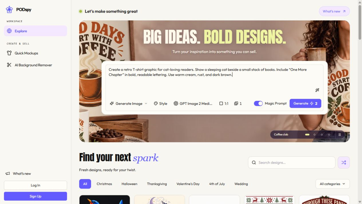
Design one recognizable silhouette and remove details that won’t survive at chest size. The badge in this guide uses two broad peaks, a sun and one trail. Use your own artwork or open the starter brief below in PODspy’s Generate Image workspace. It fills the editable brief; you choose when to generate.
Review the export on the intended shirt color. If the artwork needs a transparent background, check the actual exported alpha channel or open it against a contrasting layer. A plain white image background is still visible. Keep intentional light shapes within the badge, and remove only the unwanted surrounding background.
Keep the source artwork separate from your placement file and your listing mockup. You’ll be able to change the print area without redrawing the mark, and the supplier won’t receive a shirt photograph instead of the art.
Create one original compact chest badge for an independent hiking club: a rounded plum shield with two broad chartreuse mountain peaks, a small coral sun and a short ivory trail. Keep the silhouette simple and balanced at small print size. Use flat solid colors, generous open shapes and thick contours. Center the complete mark on a plain white background with even margins. Show artwork only, with no words, letters, numbers, brand logos, mockup, garment, shadows or distressed texture.
Work through a 0.6-inch shift from transparent padding
Suppose the supplier allows this 1,200 × 1,200-pixel upload to represent a 4 × 4-inch zone. That makes the example 300 pixels per inch. Our visible badge is 720 × 600 pixels, so it measures 2.4 × 2 inches at that scale. We use a slightly smaller badge here to make the extra space easy to see.
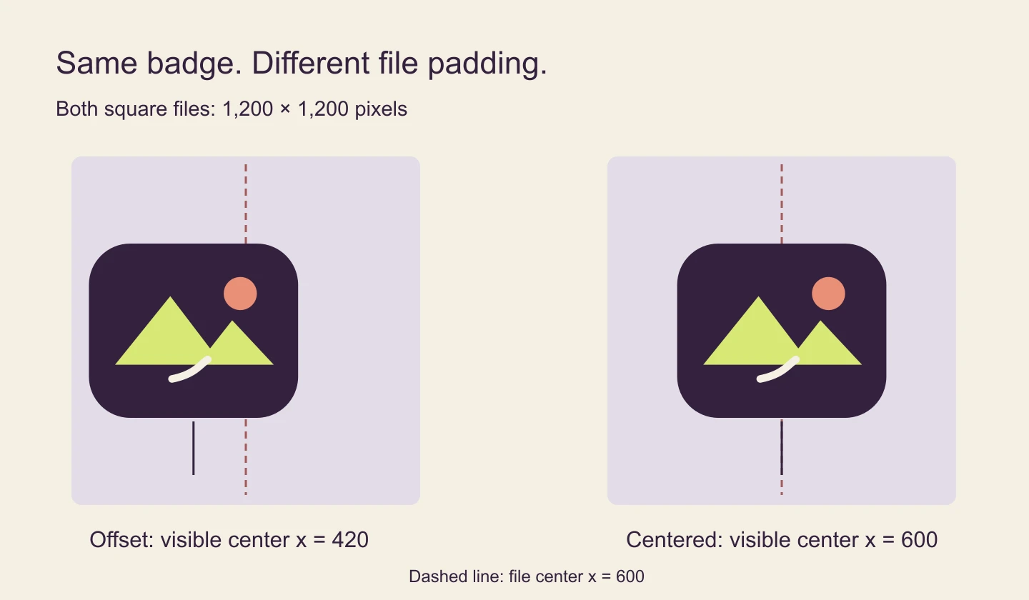
In the first download, the artwork starts at x = 60 and ends at the boundary x = 780. Its horizontal center is (60 + 780) ÷ 2 = 420. The file center is x = 600. If the editor centers the full file without trimming, the badge sits 180 pixels left of that center, or 0.6 inches at this example scale. A different editor may trim empty pixels automatically; inspect what your own preview does.
In the corrected download, the same badge spans x = 240 to 960. The visible center is now x = 600. The art and canvas are unchanged in size. Only the horizontal position of the mark inside the PNG changed. Both downloads are original digital examples; we verified their bounds and matched the badge pixels. Neither file was sent to a printer.
To repair your file, measure the nontransparent bounds in an editor. If the supplier expects a specific canvas, keep that canvas and reposition the artwork inside it. If the supplier expects standalone artwork, trim unwanted transparent padding and set the visible dimensions again on upload. Inspect any intentional offsets and faint stray pixels before committing to the new bounds.
Check the supplier proof before making listing images
Upload the artwork to the selected print area. Use the editor’s actual measurements if it provides them, and compare the visible mark with the intended width and height. Confirm the wearer’s left, check that the mark stays within the supported boundaries, and inspect its contrast on each color you plan to offer. Save a note with the blank, provider, print method, placement and approved dimensions so you can repeat the setup.
Check a small and a large offered size. Some providers scale certain print methods down on smaller garments, and a preview can still depict a reference size. Printify describes that behavior for DTG and most DTF apparel. Its documented preview behavior is specific to its workflow; check the rules for your actual provider and product rather than assuming every size will look like the same reference mockup.
An optional paper check makes the width tangible: print or draw the mark at the intended physical width, measure it with a ruler, and hold it on a shirt of the same cut. That checks visual proportions only. For an order where the location is critical, review a physical sample in your chosen method before selling at scale. Keep the provider’s placement tolerance in mind and avoid layouts that depend on perfectly aligning a printed edge to a seam.
Once the supplier setup is approved, make the listing mockup reflect that setup. Use a straight-on view for orientation and a closer crop for detail. If you offer sizes that differ noticeably, don’t rely on one reference image to show every proportion.
Common left-chest placement questions
Is the left chest my left when I’m looking at the shirt? No. In a non-mirrored front view, put the logo on the viewer’s right to place it on the wearer’s left.
How far below the collar should the logo go? There’s no single measurement for every shirt. A distance from the bottom collar to the top of the graphic is different from a shoulder-seam-to-center measurement. Use the exact print zone and evaluate the balance between collar and armhole in the supplier preview.
Why does a centered file still look off? The artwork may be offset inside its canvas. Check its visible bounds and correct unwanted padding. If the bounds are centered and it still looks uneven, evaluate the visual weight of the shape before making a small adjustment that stays inside the supplier’s supported area.