 PODspy

DTG prints ink directly onto a garment. DTF prints a design onto a transfer film, then uses adhesive and heat to apply it to the garment. DTG is a common starting point for cotton apparel when a soft feel matters. DTF offers a wider range of compatible fabrics, including many blends and synthetics. For a print-on-demand seller, the useful decision comes from the exact product, the amount of artwork covering it, and how the finished sample feels. Use this workflow to choose a method for one design.
The creative shortcut
- Choose the exact garment and print area before deciding on a method.
- Review opaque coverage, open space, and small details at the intended size.
- Compare samples with the same artwork and record what actually changes.
Compare the printing route and the feel you need
With DTG, a printer jets ink onto the garment and the provider cures it. Pretreatment and white ink may be part of the process, depending on the garment and production setup. With DTF, the provider prints on film, adds adhesive powder, cures it, and heat-presses the transfer onto the fabric. The carrier film is removed after application.
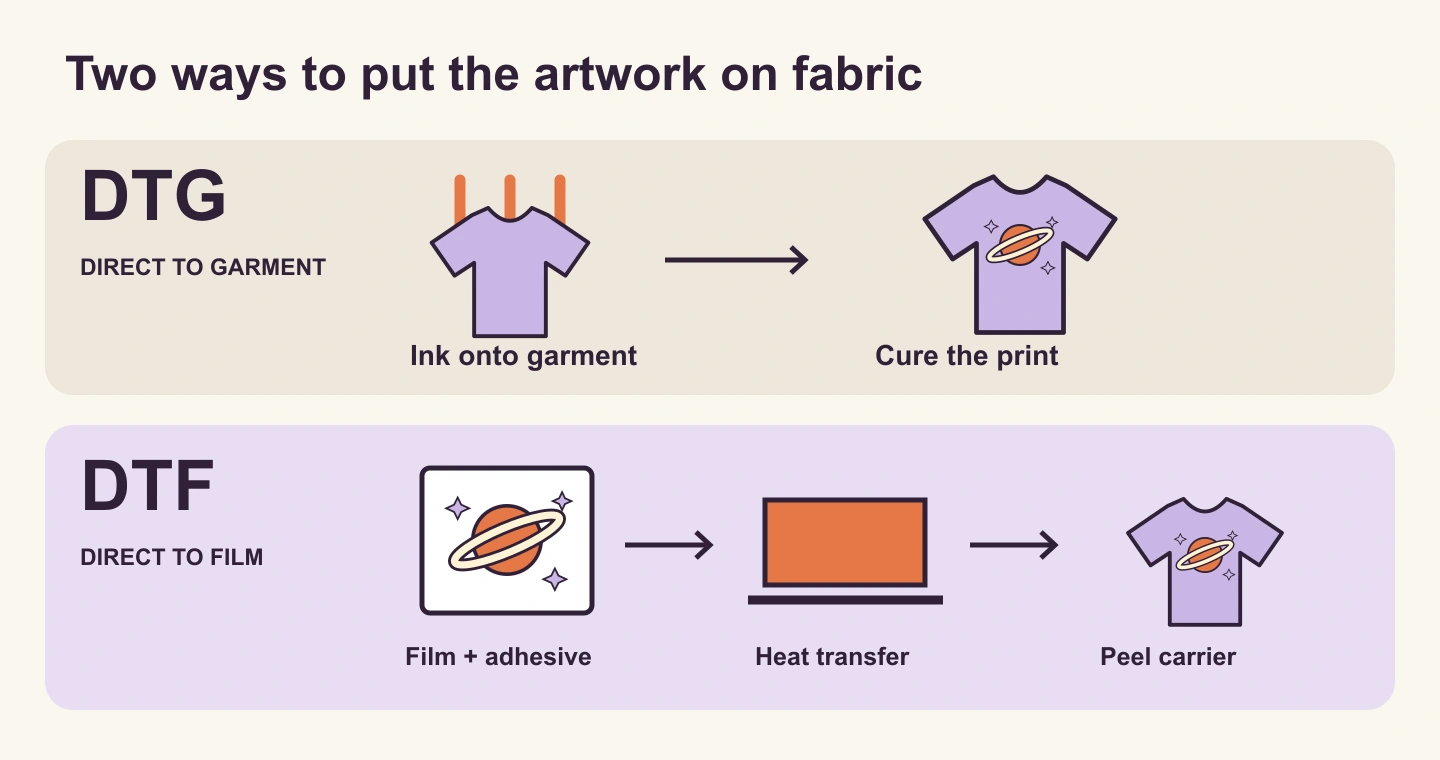
DTG is widely used on cotton and high-cotton apparel. DTF can work across more fabric types, but compatibility still belongs to the exact product and provider. Look for a supported decoration method on the product you will fulfill. The same blank name sold by two providers may have different print options.
Think about how the design will be worn. A small emblem and a wide solid chest graphic put very different amounts of print on a shirt. Feel varies with the artwork, fabric, ink system, and production. If softness is central to the product, make that a sample-review criterion from the beginning.
- Cotton everyday tee with a small illustration — compare the available DTG option first if a soft finish is your priority.
- Polyester or a mixed-fabric collection — check the product’s supported DTF options and care requirements.
- Large solid graphic — evaluate the printed area and feel in a sample with either method.
Choose the product, color, and placement together
Write down a specific product before preparing the final file. Include the blank, fiber composition, color, size range, print location, and fulfillment provider. Then check which technique is offered for that combination. A front print, sleeve print, and inside label can follow different requirements.
For a dark shirt, ask how the provider handles white ink and the underbase beneath colors. An underbase can affect the appearance of pale edges and low-opacity artwork. For white shirts, check how white parts of the design are treated. For example, Printful says it does not print white ink on white garments for DTG.
Suppose you want the orange planet in this guide on a navy cotton tee. Start with a DTG candidate for that exact tee and a DTF candidate where available. If you switch one candidate to a polyester performance shirt, record that change. You will be comparing two finished product combinations, so the fabric becomes part of the result.
Inspect coverage, transparency, and detail at the final size
Start with the artwork’s opaque footprint. A rectangular colored panel covers the space behind the planet and its orbit. Removing that panel leaves open fabric between the solid shapes. The two files can have the same pixel canvas and intended width while covering different areas. Choose the version that suits the design, then compare its actual feel in a sample.
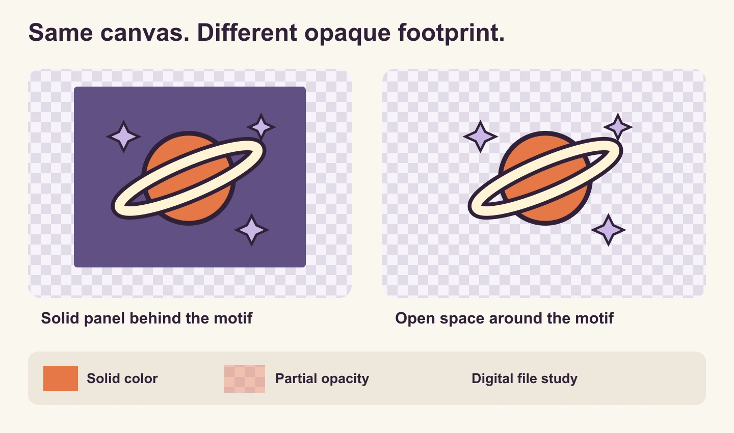
Fully transparent space and semi-transparent color need separate checks. A transparent gap between two solid shapes lets the fabric show through. A glow, soft shadow, or low-opacity brush mark contains partially transparent pixels. Printful’s file guidance warns that these effects can print differently from the screen preview, particularly with DTG or DTF on colored garments.
Inspect the exported artwork over both light and dark backgrounds. Check whether the orbit has stray pale pixels, whether all stars are intentionally separate, and whether tiny marks remain readable at the intended physical width. Ask the provider how to handle fades or halftones if the effect is essential.
Use the chosen provider’s minimums for lines and text. As one product-specific example, Printful’s DTFlex guidance calls for lines at least 1 pt thick, approximately 4 pixels at 300 DPI. That is a provider requirement to check against the final artwork size. Enlarging the canvas or changing a resolution label does not repair thin or blurry artwork.
Create one artwork master before making product versions
Use a single concept so you can compare the product choices without changing the subject at the same time. The example below uses an orange planet, a broad ivory orbit, and three solid stars. Open the brief in PODspy’s Generate Image workspace and edit it before choosing to generate.
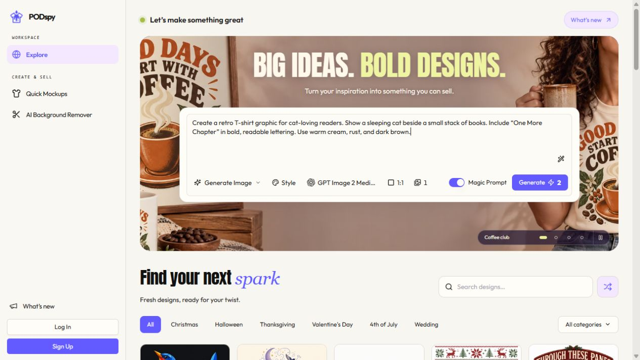
Review the result for unwanted text, odd shapes, tiny fragments, and soft edges. Save an artwork master, then prepare a separate file for each product’s template. If you need transparency, remove the background and inspect the exported PNG. A request for a plain background in a prompt still needs that file check.
Set the physical print width and required pixel dimensions from each product’s File guidelines. Printful currently recommends at least 150 DPI for its DTG apparel and 300 DPI for DTFlex. For an illustrative 10-inch-wide artwork, those resolutions correspond to 1,500 and 3,000 pixels across. Follow the exact template if it specifies a different canvas or safe area.
Create an original flat graphic for a night-walking T-shirt. Show one burnt-orange planet crossed by a broad ivory orbit, with exactly three chunky four-point stars placed around it. Use deep plum outlines and one muted lavender accent. Keep the shapes solid and clearly separated, with generous open space and thick readable details. Center the artwork on a plain white background. Show the artwork only. Do not include words, logos, a shirt, a mockup, shadows, glows, smoky fades, tiny speckles, or a rectangular color panel.
Compare samples with a written plan
Use the same master artwork, intended width, placement, and garment color wherever both product options allow. Record every difference you cannot hold constant, including blank, fabric, supplier, and file changes required by the method. Save the file names and product settings alongside the order details.
Review both samples under the same lighting. Check the smallest star, the planet edge, white areas, and any unintended border. Then feel the large solid areas and the open gaps. Look at the design while the garment is worn at a normal viewing distance. A mockup can help assess placement before a sample, while texture and feel need the physical product.
Before laundering, photograph the same details on each sample. Follow each product’s care label and record the wash and drying conditions if you compare wear later. Keep the elapsed washes and the observed change together. One sample per method can guide this product decision, but it cannot establish a universal lifespan for either technique.
Compare the delivered cost for the actual product and destination, including the print locations, shipping, and applicable charges. Pair that number with your observations. If you change the garment or provider later, repeat the parts of the check that changed before carrying over your listing claims.
- Sample A — exact DTG product, fabric, color, size, print location, artwork file and width.
- Sample B — exact DTF product with the same artwork and width where supported, plus any differences.
- Review notes — edge clarity, small details, colors, printed-area feel, placement and delivered cost.
- Follow-up — care instructions used, wash count, photographs and the date of each observation.
Common DTG and DTF questions
Which should I choose for a cotton shirt? Start with the available DTG option when soft feel is a priority, and compare DTF if its finish or supported product is appealing. Use the actual design and blank to make the final call.
Can DTG print on dark shirts? Yes. Dark garments may use a white underbase. Check the product guidance and a sample for how your colors and edges appear.
Can I use one PNG for both? You can begin with one artwork master. Confirm the size, resolution, transparency, and fine-detail requirements for both products before reusing an export.
Which lasts longer? Judge the specific garment, method, provider, and care process together. Record your sample observations before making durability claims in a listing.


