 PODspy

A useful T-shirt design idea connects a specific audience with a visual style they would actually wear. AI can help you explore that connection without rebuilding every composition by hand. Here are six directions to develop in PODspy, followed by a simple way to turn your favorites into a focused collection.
The creative shortcut
- Connect one audience with a recognizable subject and a short phrase.
- Use the six briefs as starting points for your own design direction.
- Build a small collection by keeping the palette and visual weight consistent.
Book lovers with a second obsession
“Book lover” is a starting audience. Add a second interest, such as cats, coffee, or gardening, to make the concept more personal. Pick one main illustration and a short original phrase so the design has a clear focus.
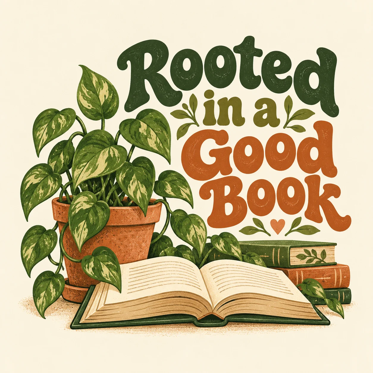
Rooted in a Good Book
Readers × houseplantsMake it yours.
For a small collection, keep the same palette and visual weight while changing the supporting subject. A cat reading beside a plant and a dog asleep on a book can share a mood without being identical. Review each result for readability rather than assuming matching prompts will produce consistent artwork.
Create a cozy T-shirt graphic for readers who love houseplants. Show an open book with a small leafy plant beside it. Add the phrase “Rooted in a Good Book” in readable rounded lettering. Use a limited earthy palette and a simple centered composition.
Teachers and everyday classroom rituals
Coffee, pencils, books, and classroom routines offer recognizable visual cues. The strongest idea usually combines a few of them around one message. Here, three paintbrushes and a palette give an art-teacher phrase a playful visual theme.
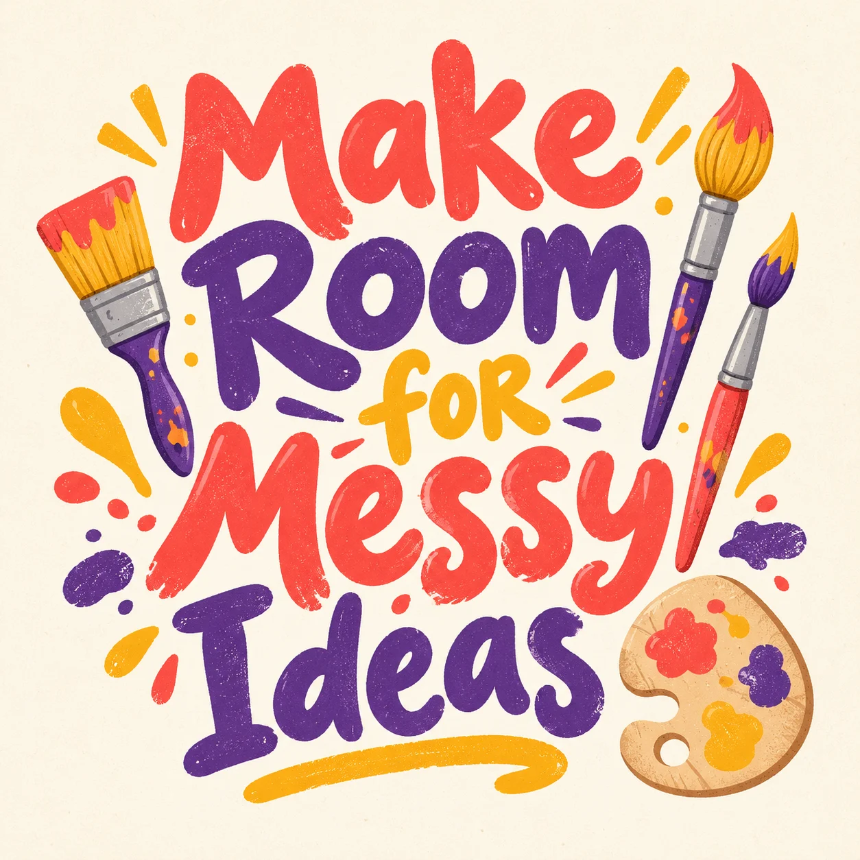
Make Room for Messy Ideas
Teachers × creative chaosMake it yours.
Try making the concept specific to an activity, such as reading aloud or making art, rather than adding more decorative elements. Check every word and ensure the design remains legible when shown at shirt size.
Create a playful T-shirt graphic for elementary art teachers. Show three paintbrushes and a small paint palette with the phrase “Make Room for Messy Ideas.” Use bold lettering, a few bright colors, and a balanced layout on a plain background.
Western lettering with a personal theme
Western design can come from the lettering, border, texture, and color choices, rather than a crowded scene. This illustrated gardening concept combines a rope border, two flowering stems, and a dominant phrase. Restrained texture keeps the words readable.
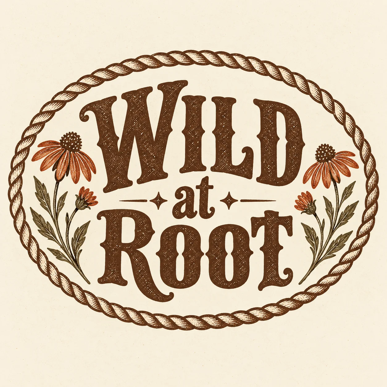
Wild at Root
Gardeners × western typeMake it yours.
Build a fresh concept around an audience you know, such as gardeners or readers. Ask for a clear hierarchy with one dominant phrase. If the texture makes the words difficult to read, reduce the distressing before adding more artwork.
Create a western-inspired graphic for gardeners with the phrase “Wild at Root.” Use bold western lettering, a simple rope border, and two small flowering stems. Choose warm brown and cream, with restrained texture and no logos.
Outdoor hobbies in a simple badge
Camping, hiking, fishing, and birdwatching can work well with a compact badge composition. Choose one activity and one focal image. A tent beneath a moon or a pair of binoculars beside a bird is easier to read than a full landscape packed with details.
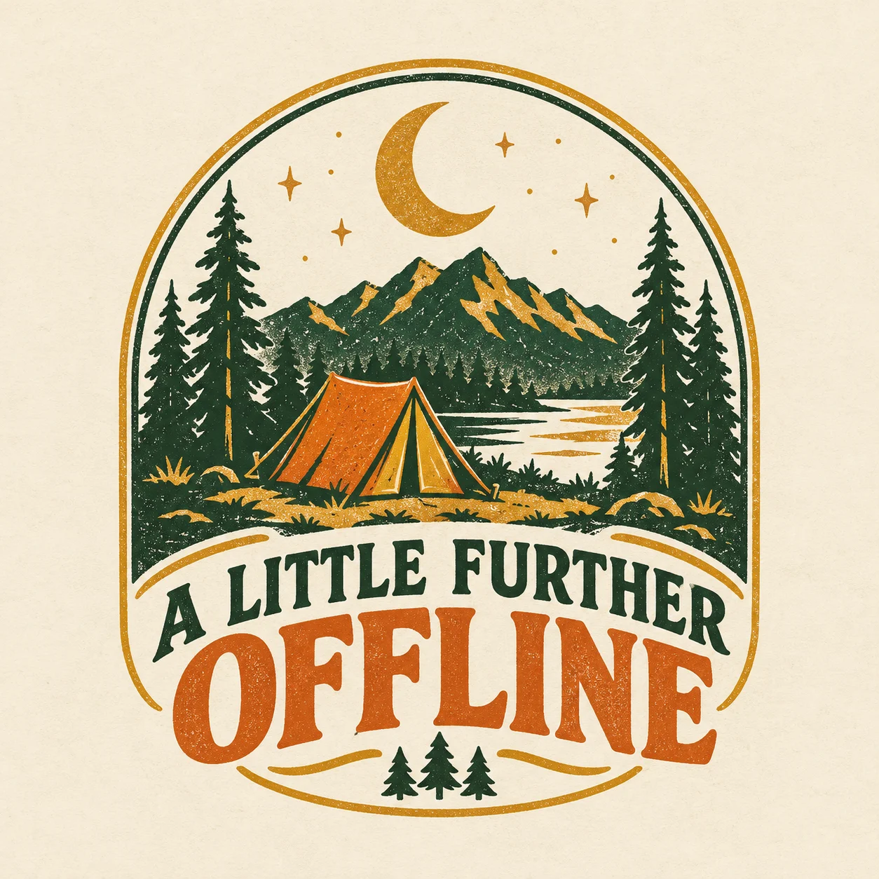
A Little Further Offline
Campers × quiet escapesMake it yours.
Use AI to explore whether the idea works best as a circle, arch, or stacked arrangement. Keep the subject and wording stable while testing the shape. Avoid organization names, park logos, or branded equipment unless you have the necessary permission.
Create a simple retro camping badge for a T-shirt. Show a small tent beneath a crescent moon with the phrase “A Little Further Offline.” Use three muted colors, bold shapes, and lettering that reads clearly from a distance.
Minimal typography with a clear point of view
Not every design needs a detailed illustration. A short phrase, a deliberate type style, and generous spacing can be a useful direction for buyers who prefer understated shirts. The design decisions are still important: letter spacing, line breaks, and contrast carry most of the personality.
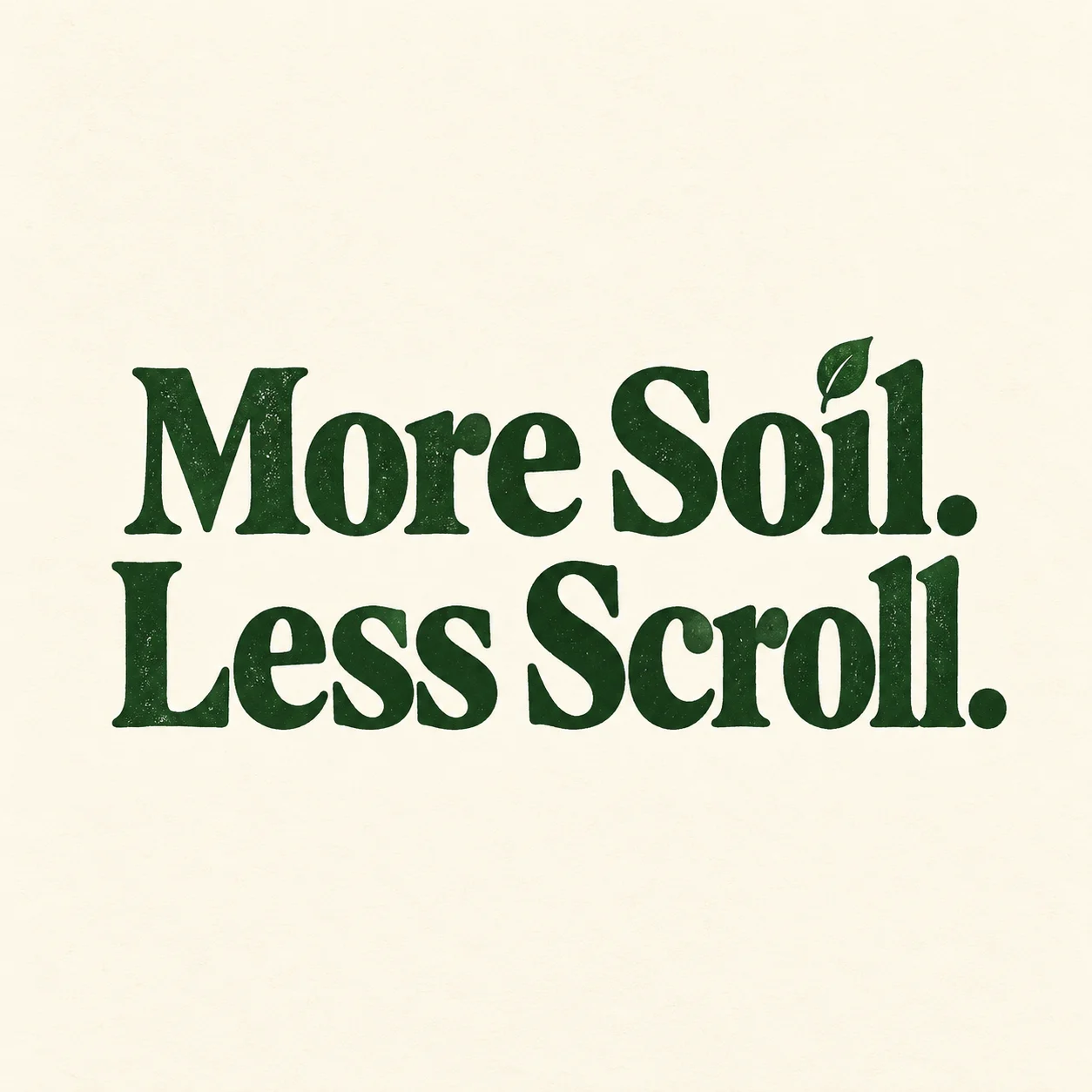
More Soil. Less Scroll.
Gardeners × a simpler lifeMake it yours.
Try a small series with the same type treatment and different original phrases for one niche. Review letterforms and punctuation closely. AI-generated typography can need corrections, especially when the design relies on the exact wording.
Create a minimal typography T-shirt design for gardeners using the exact phrase “More Soil. Less Scroll.” Use two balanced lines of bold readable lettering and one tiny leaf accent. Keep the palette to a single dark ink on a plain light background.
Pet personalities with a specific mood
Choose a behavior a pet owner recognizes: a cat claiming the best chair, a dog waiting for a walk, or a rabbit inspecting a houseplant. Pair the behavior with a short line that makes the idea understandable without explaining it.
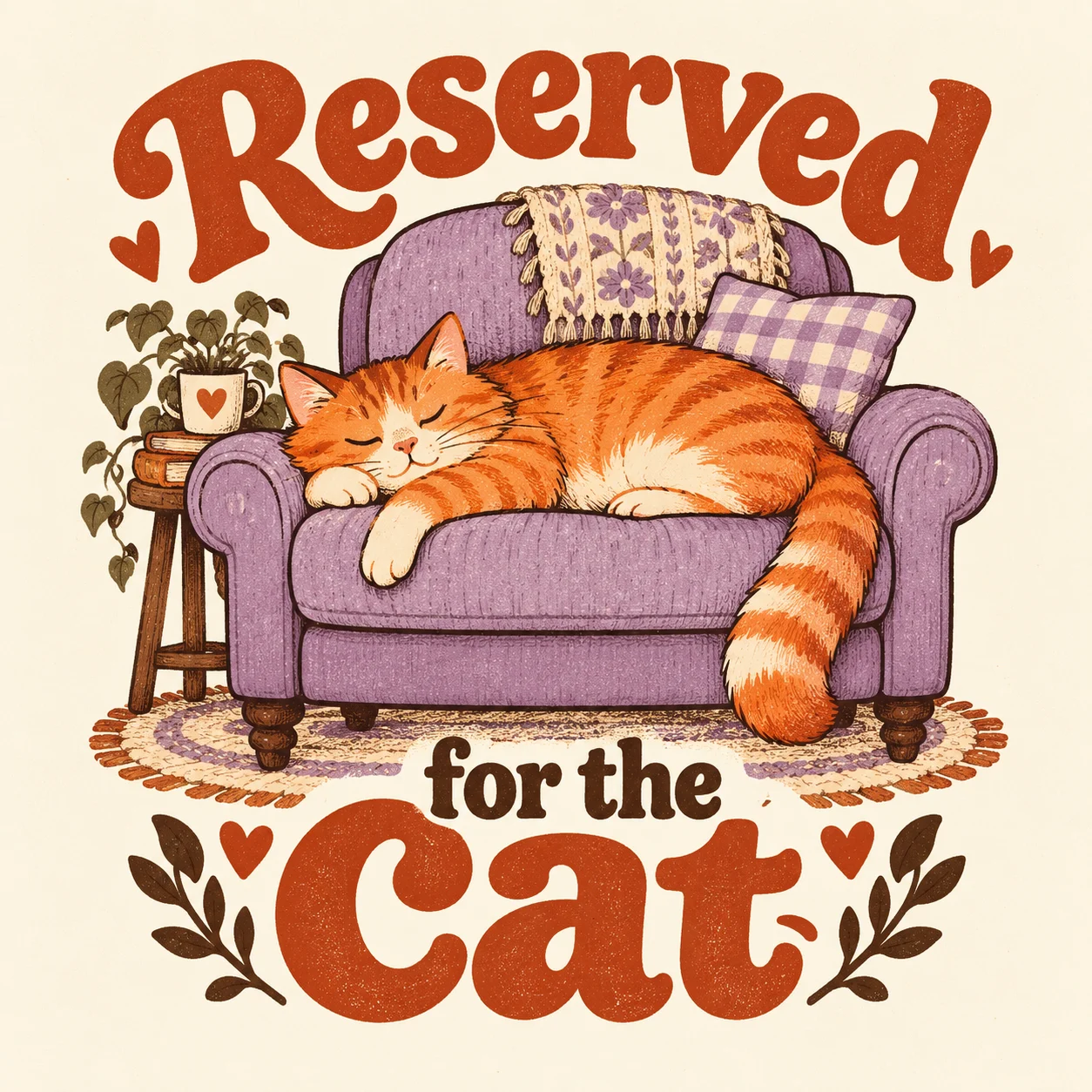
Reserved for the Cat
Cat people × cozy momentsMake it yours.
Develop variations around the mood rather than swapping species into an unchanged design. A sleepy cat and an energetic dog may need different poses and lettering to make the idea feel natural. Review generated animals for odd anatomy and visual artifacts.
Create a humorous T-shirt graphic of a sleepy cat taking up an entire armchair. Add the phrase “Reserved for the Cat” in clear lettering. Use a warm illustrated style, a compact composition, and only a few supporting details.
Turn one direction into a collection without starting over
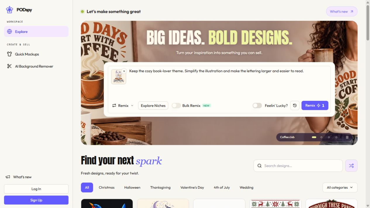
Pick one audience and save a short creative brief: subject, phrase, palette, lettering style, and composition. In PODspy, use generation to establish the direction, then editing or remixing to explore a specific change. Keep a version you like before trying the next variation.
Limit the first collection to a few designs you can review carefully. Check text, composition, final file requirements, and your rights to the materials and phrases. Put the best options on mockups to judge whether they belong together as products.
These prompts are starting briefs, not tested output guarantees or proof of market demand. Use your knowledge of your buyers and the response to your own listings to decide what to develop next.
Where the paid value comes from
The value of PODspy is the work it helps you repeat with less effort: finding a visual direction, making a variation, refining the result, and continuing into a mockup. You still decide what is good enough to put in your store.

Time one complete design session, including revisions and cleanup. If you create regularly, compare that experience with the current plan price and credit allowances. A workflow that saves useful time every week is a stronger reason to subscribe than a single impressive generation.
Start with the direction you understand best. Build one design you would be comfortable selling, learn which parts of the process need your attention, and use that experience to guide the next one.


